Path Analysis
A real event log contains from a hundred to a million paths. Although you may want to look at individual paths, mostly you look at them as a whole. Every visualization in this library is an aggregated representation of the same trajectories that keeps some aspects of each path. Retentioneering builds three such representations: by step, by transition, by milestone. This page demonstrates each of them and explains how to choose the right one for your question.
A path is the unit of analysis
A raw event log has one row per event. The journey appears once you group rows by who did them and sort by time. That ordered sequence is a path. What counts as a path is your choice, not the library's. Typically, you want to switch between user-level and session-level paths. See Eventstream key concepts for how to declare and switch between path definitions.
Those five paths are the running example for the rest of this page:

Loaded into an Eventstream — the object every tool on this page is called on — they look like this:
import pandas as pd
import retentioneering as rete

paths = {
    "u1": ["home", "catalog", "cart", "purchase"],
    "u2": ["home", "catalog", "cart", "purchase"],
    "u3": ["home", "catalog", "catalog", "cart"],
    "u4": ["home", "search", "cart"],
    "u5": ["home", "search", "search"],
}
df = pd.DataFrame(
    [
        {"user_id": path_id, "event": event, "timestamp": f"2024-01-01 10:0{step}"}
        for path_id, events in paths.items()
        for step, event in enumerate(events)
    ]
)
stream = rete.Eventstream(df)
Every widget shown below is that stream — so each one renders exactly the five paths above, and you can check its numbers by hand. See Eventstream for loading your own data, naming columns and declaring a schema.
You will also meet two events that appear in no event log: path_start and path_end. Retentioneering automatically brackets every path with them depending on the path_col argument that is given to the widget.
Representation 1: by step
A natural way to visualize paths is to stack them up so they would form a trajectory tree.
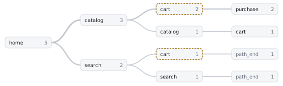
On five paths it is the clearest view available: every route is visible, and each branch carries the number of paths on it. On real data it stops working. Branching compounds at every step, so even a few thousand paths over a few dozen event names give a tree with nearly as many leaves as there are paths. Nothing repeats often enough to be legible, and no layout rescues it.
The way out is to give up which branch a path came from and keep where in the path it is: group the paths by step and look at the distribution of events at each step. Everything at the same depth carrying the same event name collapses into one number.
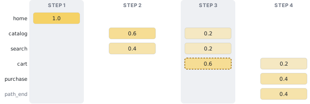
That table is the Step Matrix: one row per event, one column per step, each cell is the share of paths sitting on that event at that step. Every column sums to 1, because every path is somewhere at every step — including the paths that are already over, which pile up in path_end. And a cell counts paths, not events: e.g. cart at step 3 is 0.6 because three of the five paths had cart as their third event.
stream.step_matrix()Step Sankey draws the exact same numbers as flows between adjacent columns instead of as a heatmap — the two widgets share a single headless method, step_sankey_data(). Use the matrix to compare one event across many steps, the Sankey to watch volume move from one step to the next.
stream.step_sankey()Blind spot: which branch a path came from. The two ways of reaching cart at step 3 — via catalog and via search — merge into a single 0.6 cell, and nothing downstream can tell them apart. In particular, a Sankey ribbon does not track individual paths across more than one hop: following three ribbons in a row does not give you the share of users who took that three-event route. See in the next section how to capture narrower sub-sequences with a path_pattern.
Aligning on any event
Steps are counted from the beginning of each path by default. That is the right frame for onboarding questions and the wrong one for almost everything else — if the thing you care about happens at step 4 for some users and step 40 for others, aligning at the start smears it across many columns.
path_pattern can re-anchor the columns on an event instead. Every path is shifted until that event sits in column 0. The steps before/after it get negative/positive numbers correspondingly:
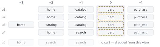
Now column −1 answers "what do users do immediately before the cart?" (75% catalog, 25% search) and column +1 answers "what happens right after?" (50% purchase, 50% the path ends). Neither question is answerable from the start-anchored view.
stream.step_matrix(path_pattern="cart")Note the denominator: u5 never reaches cart, so it is not in this picture at all, and the shares are out of the four paths that do. Re-anchoring silently redefines the population to "paths that match the pattern" — which is usually what you want, and always worth knowing.
Two more anchors worth having:
path_pattern="path_end"— centers on where paths stop, so the columns to its left are the last things users did before leaving.path_pattern="catalog->.*->purchase"— several anchors in sequence, where.*matches any run of events. This allows you to explore steps surrounding events in a funnel pattern.path_pattern="[payment_error|checkout_bug]"— one position can also be a class of events: any of several, or anything but a few ([^home]), or any event at all (.). See Path Patterns for the whole syntax.
Representation 2: by transition
Now drop position altogether and look at one transition at a time. Every path breaks down into the pairs of events that follow each other in it (bigrams, if you know the term from text analysis). For example, u3, home → catalog → catalog → cart, gives the pairs home→catalog, catalog→catalog and catalog→cart. Transition graph is a graph where nodes are unique events, edges are transitions between them, and the edge weight is some numerical characteristic of the transition, e.g. transition count.
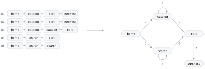
stream.transition_graph(edge_weight="count")This buys two things the step representation cannot give you:
- Loops become visible.
u3's two consecutivecatalogevents andu5's twosearchevents are pairs like any other, so they turn into self-loops. Users going in circles are one of the most common findings in real event logs, and this is the representation that shows them directly. - The picture stays finite. However long the paths, the graph has one node per distinct event — so it works as a map of the product, while the step representation grows a column per step.
A transition can be scored by more than a count: by how many distinct paths made it, by a transition probability (a.k.a. Markov transition probabilities, the default option), by how long it takes. See the full list is on the Transition Graph page.
Blind spot: when it happened. A cart → purchase edge of weight 2 says two transitions happened somewhere; it does not say whether it was on step 3 or step 30, or whether they happened in the same path, or what exactly preceded them (the latter explains why Markov chains are called "memoryless" models).
Representation 3: by milestone
A Funnel keeps only the events you name, and asks of each path: did it reach these, in this order? Everything in between is ignored.
stream.funnel(steps=["home", "cart", "purchase"])Of the five paths, all five hit home, four reach cart (u5 never does) and two go on to purchase — 100% → 80% → 40%.
Blind spot: everything that is not a milestone — which is exactly why a funnel is easy to explain to stakeholders and unable to tell you why the drop happened. See how to analyze what happens between funnel levels.
Comparing groups of paths
Every representation above summarizes one population of paths, while most real questions are comparative: this cohort against that one, before against after, converted against not. Define the groups as a segment — an A/B arm, a platform, an acquisition channel, a time window, a behavioral cluster, a rule over your own columns — and every core widget will render group1 − group2 in place of one group's numbers (diff mode).
Three important cases that are widely used in practice:
- An anomalous period. A dynamic segment splits the eventstream into "inside the window" and "outside", and a diffed widget shows which steps or transitions actually degraded there — see Find a root cause in an anomalous period.
- How far a path got in a funnel.
add_segment(..., funnel_events=[...])labels every path with the deepest funnel level it completed in order, so "stalled atcart" and "converted" become two comparable groups — see Open up the funnel. - The user's state. A user is not the same person in their first session and in their fiftieth.
split_sessionsnumbers each path's sessions, and a rule over that number turns it into named stages — first session, getting familiar, experienced — so the diff compares the same people at different points of their lifetime — see Compare newcomers with experienced users.
Because both groups are still summarized from raw events, the difference lands on a concrete event, step or transition instead of on another aggregate rate — which is what makes this a root-cause tool rather than a reporting one.
More than two levels? A segment often has more levels than that — six acquisition channels, dozens of countries or regions — and diffing every pair is not a plan. Segment Overview puts metrics in rows and segment levels in columns, so one heatmap tells you which level is the outlier and on which metric. That is the big picture; the diff is the drill-down that follows it.
Need behavioral segments? Every example above starts from a rule you already had in mind. When you don't have one, Cluster Analysis goes the other way round — it groups paths by their metrics, suggests a splitting, and lets you inspect what each cluster actually contains. Once clustered, it becomes an ordinary segment column: from there it is the same diff and the same three representations as everything else on this page.
Preparing the data
Event logs rarely arrive in a shape worth analysing. Event names are whatever the tracking code happened to emit, passing-by users and bots sit next to meaningful ones, sessions are not marked, etc. Data processors are small methods built for exactly this kind of work — filtering, renaming, collapsing, splitting, labelling. Each one returns a new Eventstream, so they chain into a readable pipeline and never modify what they were called on:
stream = (
    rete.Eventstream(df)
    .filter_events(drop={"event": ["checkout_bug"]})
    .split_sessions(timeout="30m")
    .truncate_paths(start_anchor="path_start", end_anchor="purchase")
)
Processors validate event names against your data, so a misspelled event raises instead of silently filtering nothing — see Data Processors.
When the picture is unreadable
Retentioneering's widgets are built for high-cardinality event logs — hundreds of distinct event names — but applied head-on to a raw log they can still come out as a hairball of a graph or a plate of Sankey spaghetti. That is rather a data-preparation signal, not a rendering problem. Consider to try the following data processors:
filter_events/drop_events— remove technical and bot events that split the paths without meaning anything.filter_paths— remove short paths or paths that do not follow the pattern you are interested in.collapse_events— merge related events (all the checkout steps into onecheckout), or squash runs of repeats.truncate_paths— cut every path down to the window you are actually asking about.
Also, treating sessions as paths might help: Path as a sequence of sessions.
Which tool for which question
| Question | Tool | Why |
|---|---|---|
| How does the product connect up? Where do users loop? | Transition Graph | The only representation that shows repetition and cycles |
| What happens right before / right after event X? | Step Matrix or Step Sankey with path_pattern="X" | Position relative to an anchor is preserved |
| How do the first N steps unfold? | Step Sankey, no pattern | Start-anchored steps are the question |
| Where do users leave? | Step Matrix with path_pattern="path_end" | Anchors on the ending |
| What share reaches these milestones in order? | Funnel | Ignores everything between them, on purpose |
| If Y happened, how often does X follow — and is that different from usual? | get_conversion_rate() | One row per pair, carrying the denominator and the base rate the number has to beat |
| Do two groups behave differently? | Any of the above with diff | Renders group1 − group2 in place |
| Which of many segment levels stands out? | Segment Overview | Scans every level on metrics at once, so you know which pair to diff |
| Which behaviors exist at all? | Cluster Analysis | Groups paths by metrics instead of by shape, and saves the result as a segment |
Asking an agent instead
The same techniques introduced on this page could be used by an LLM agent with the help of the built-in MCP server or skills.
Next steps
- Widgets — the shared behaviour of every visualization: diff mode, headless twins, HTML export.
- Segments — how to define the groups you compare.
- Recipes — these ideas applied to concrete product questions.
- Data processors — how to prepare the data for analysis.
- MCP server — connecting an agent, the full tool list, and what it can and cannot do.